Exam2pass
0 items Sign In or Register
  • Home
  • IT Exams
  • Guarantee
  • FAQs
  • Reviews
  • Contact Us
  • Demo
Exam2pass > CompTIA > CompTIA Certifications > DA0-001 > DA0-001 Online Practice Questions and Answers

DA0-001 Online Practice Questions and Answers

Questions 4

Which of the following contains alphanumeric values?

A. 10.1²

B. 13.6

C. 1347

D. A3J7

Buy Now

Correct Answer: D

Explanation: Alphanumeric values are values that contain both letters and numbers, such as A3J7. The other options are numeric values, as they contain only numbers, such as 10.1E2, 13.6, and 1347. Reference: Guide to CompTIA Data+ and Practice Questions - Pass Your Cert

Questions 5

Andy is a pricing analyst for a retailer. Using a hypothesis test, he wants to assess whether people who receive electronic coupons spend more on average.

What should Andy's null hypothesis be?

A. People who receive electronic coupons spend more on average.

B. People who receive electronic coupons spend less on average.

C. People who receive electronic coupons do not spend more on average.

D. People who do not receive electronic coupons spend more on average.

Buy Now

Correct Answer: C

The null hypothesis presumes the status quo. Andy is testing whether or not people who receive an electronic coupon spend more on average, so, the null hypothesis states that people who receive the coupon do spend more on average.

Questions 6

Which of the following best describes a difference between JSON and XML?

A. JSON is quicker to read and write.

B. JSON has to use an end tag.

C. JSON strings are longer

D. JSON is much more difficult to parse.

Buy Now

Correct Answer: A

The best answer is A. JSON is quicker to read and write. JSON (JavaScript Object Notation) is a lightweight data-interchange format that is based on the JavaScript programming language and easy to understand and generate. JSON uses a simple syntax that consists of name-value pairs and arrays, and does not require any end tags or attributes. JSON is quicker to read and write than XML (Extensible Markup Language), which is a markup language that uses a tag structure to represent data items. XML has a more complex and verbose syntax that requires end tags, attributes, and namespaces123

Questions 7

Which of the following can be used to translate data into another form so it can only be read by a user who has a key or a password?

A. Data encryption.

B. Data transmission.

C. Data protection.

D. Data masking.

Buy Now

Correct Answer: A

Data encryption can be used to translate data into another form so it can only be read by a user who has a key or a password. Data encryption is a process of transforming data using an algorithm or a cipher to make it unreadable to anyone except those who have the key or the password to decrypt it. Data encryption is a common method of protecting data from unauthorized access, modification, or theft. Reference: Guide to CompTIA Data+ and Practice Questions - Pass Your Cert

Questions 8

Which of the following roles is responsible for ensuring an organization's data quality, security, privacy, and regulatory compliance?

A. Data owner.

B. Data steward.

C. Data custodian.

D. Data processor.

Buy Now

Correct Answer: B

Correct answer B. Data steward.

A data steward is responsible for leading an organization's data governance activities, which include data quality, security, privacy, and regulatory compliance.

Questions 9

A data analyst needs to create a data visualization that aids in un the cumulative impact of sequentially introduced values that are positive or negative. Which of the following data visualization methods should the analyst use?

A. A bubble chart

B. A waterfall chart

C. A scatter plot

D. A line chart

Buy Now

Correct Answer: B

Explanation: A waterfall chart is a type of data visualization that shows the cumulative impact of sequentially introduced values that are positive or negative. A waterfall chart typically has an initial value and a final value, with intermediate values shown as floating columns that either add to or subtract from the initial value. A waterfall chart can help visualize how different factors contribute to a net change in a value over time. Therefore, the correct answer is B. References: [Waterfall Chart | Definition and Examples - Investopedia], [Waterfall Charts in Excel | How to Create Waterfall Chart in Excel?] 4of30

Questions 10

A company's marketing department wants to do a promotional campaign next month. A data analyst on the team has been asked to perform customer segmentation, looking at how recently a customer bought the product, at what frequency, and at what value. Which of the following types of analysis would this practice be considered?

A. Prescriptive

B. Trend

C. Gap

D. Custer

Buy Now

Correct Answer: D

Customer segmentation is a type of cluster analysis, which is a method of grouping data points based on their similarities or differences. Cluster analysis can help identify patterns and trends in the data, as well as target specific groups of customers for marketing purposes. One common technique for customer segmentation is RFM analysis, which stands for recency, frequency, and monetary value. This technique assigns a score to each customer based on how recently they bought the product, how often they buy the product, and how much they spend on the product. These scores can then be used to create clusters of customers with different characteristics and preferences. Therefore, the correct answer is D. References: Cluster Analysis - Statistics Solutions, RFM Analysis: The Ultimate Guide for Customer Segmentation

Questions 11

Given the image below:

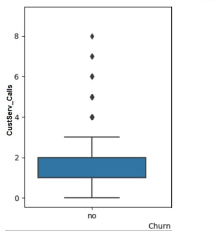
The data should be cleaned because of the presence of:

A. outlier B. non-parametric data.

C. multicollinearity.

D. invalid data.

Buy Now

Correct Answer: A

Explanation: The answer is A. Outlier.

Short explanation: An outlier is a data point that differs significantly from the rest of the data in a dataset. An outlier can indicate an error, an anomaly, or a rare event in the data. An outlier can affect the statistical analysis and visualization of

the data, such as skewing the mean, variance, or distribution of the data. Therefore, data should be cleaned to identify and remove or correct any outliers.

The image below shows a box plot graph with a vertical axis labeled "Customer Calls" and a horizontal axis labeled "Churn". The box plot is blue in color and the median value is around 2. There are 7 outliers above the box plot, ranging from

4 to 8.

image)

A box plot is a type of graph that can show the distribution of data values using five summary statistics: minimum, maximum, median, first quartile, and third quartile. The box represents the interquartile range (IQR), which is the difference

between the first and third quartiles. The median is shown as a line inside the box. The whiskers extend from the box to the minimum and maximum values, excluding any outliers. Outliers are shown as dots or circles outside the whiskers.

In this graph, we can see that most of the customer calls are between 0 and 4, with a median of 2. However, there are 7 outliers that have more than 4 customer calls, up to 8. These outliers may indicate some customers who have more

issues or complaints than others, or some errors or anomalies in the data collection or recording process. These outliers can affect the analysis and interpretation of the customer calls and churn relationship, such as making it seem that more

customer calls lead to less churn, which may not be true for the majority of the customers. Therefore, data should be cleaned to investigate and handle these outliers appropriately.

Questions 12

A customer list from a financial services company is shown below:

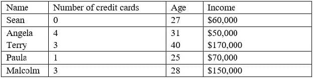
A data analyst wants to create a likely-to-buy score on a scale from 0 to 100, based on an average of the three numerical variables: number of credit cards, age, and income. Which of the following should the analyst do to the variables to ensure they all have the same weight in the score calculation?

A. Recode the variables.

B. Calculate the percentiles of the variables.

C. Calculate the standard deviations of the variables.

D. Normalize the variables.

Buy Now

Correct Answer: D

Normalizing the variables means scaling them to a common range, such as 0 to 1 or -1 to 1, so that they have the same weight in the score calculation. Recoding the variables means changing their values or categories, which would alter their meaning and distribution. Calculating the percentiles of the variables means ranking them relative to each other, which would not account for their actual magnitudes. Calculating the standard deviations of the variables means measuring their variability, which would not make them comparable. References: CompTIA Data+ Certification Exam Objectives, page 10

Questions 13

An analyst is designing a dashboard to determine which site has the highest percentage of new customers. The analyst must choose an appropriate chart to include in the dashboard. The following data is available:

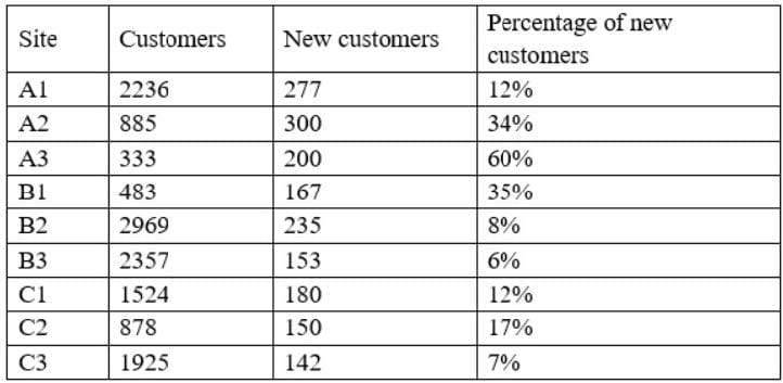
Which of the following types of charts should be considered to BEST display the data?

A. Include a bar chart using the site and the percentage of new customers data.

B. Include a line chart using the site and the percentage of new customers data.

C. Include a pie chat using the site and percentage of new customers data.

D. Include a scatter chart using the site and the percent of new customers data.

Buy Now

Correct Answer: A

Explanation: This is because a bar chart is a type of chart that shows the value or the amount of a single variable for different categories or groups, such as the percentage of new customers for different sites in this case. A bar chart can be used to display and analyze the comparison, ranking, or proportion among the categories or groups, as well as identify any differences, similarities, or outliers in the data. For example, a bar chart can show which site has the highest or lowest percentage of new customers, as well as show how much each site contributes to the total percentage of new customers. The other types of charts are not the best charts to display the data. Here is why:

A line chart is a type of chart that shows the change or the trend of a single variable over time, such as the percentage of new customers over months or years in this case. A line chart can be used to display and analyze the movement, cycle, or pattern of the variable, as well as identify any peaks, valleys, or fluctuations in the data. For example, a line chart can show how the percentage of new customers increases or decreases over time, as well as show if there are any seasonal or periodic variations in the data. A pie chart is a type of chart that shows the proportion or the percentage of a single variable for different categories or groups, such as the percentage of new customers for different sites in this case. A pie chart can be used to display and analyze the composition, distribution, or share of the variable, as well as identify any segments, slices, or fractions in the data. For example, a pie chart can show how much each site represents of the total percentage of new customers, as well as show if there are any dominant or minor sites in the data. A scatter chart is a type of chart that shows the relationship between two variables for each observation or unit in a data set, such as the percentage of new customers and another variable for each site in this case. A scatter chart can be used to display and analyze the correlation, trend, or pattern among the variables, as well as identify any outliers or clusters in the data. For example, a scatter chart can show if there is a positive, negative, or no correlation between the percentage of new customers and another variable, such as sales revenue or customer satisfaction.

Exam Code: DA0-001
Exam Name: CompTIA Data+
Last Update: May 28, 2026
Questions: 367

PDF (Q&A)

$45.99
ADD TO CART

VCE

$49.99
ADD TO CART

PDF + VCE

$59.99
ADD TO CART

Exam2Pass----The Most Reliable Exam Preparation Assistance

There are tens of thousands of certification exam dumps provided on the internet. And how to choose the most reliable one among them is the first problem one certification candidate should face. Exam2Pass provide a shot cut to pass the exam and get the certification. If you need help on any questions or any Exam2Pass exam PDF and VCE simulators, customer support team is ready to help at any time when required.

Home | Guarantee & Policy |  Privacy & Policy |  Terms & Conditions |  How to buy |  FAQs |  About Us |  Contact Us |  Demo |  Reviews

2026 Copyright @ exam2pass.com All trademarks are the property of their respective vendors. We are not associated with any of them.