TDS-C01 Online Practice Questions and Answers
You create a crosstab that shows a list of 100 hotel chains alongside their average nightly cost. You also create two groups showing, respectively, the top 10 and bottom 10 hotel chains by cost, with subtotals. What should you do to improve the crosstab and compare the two groups to all the remaining hotel chains?
A. Create a new view.
B. Color encode the hotel chain names.
C. Include an Other group.
D. Include the Summary card.
You have a visualization that uses multiple types of sorting. How can you clear all sorting of the visualization?
A. From the Dashboard menu, select Clear.
B. Right-click a sorted field, and then select Clear Sort.
C. From the Worksheet menu, select Clear, and then select Sorts.
D. From the Header label, select the sort icon.
When creating a histogram in Tableau, to what does bin size refer?
A. The maximum number of marks in the view
B. The range of the continuous measure counted in each bin
C. The count distinct (COUNTD) of items on either axis
D. The minimum number of axis ticks in the view
To display data that has both negative and positive quantitative values, Tableau Desktop will display marks by using ________________________ as the default.
A. a sequential palette
B. the full color range
C. a diverging palette
D. a categorical palette
You want to use visual clusters to show data trends on a map.
Which type of map should you use?
A. Flow
B. Symbol
C. Choropleth
D. Density
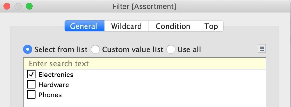
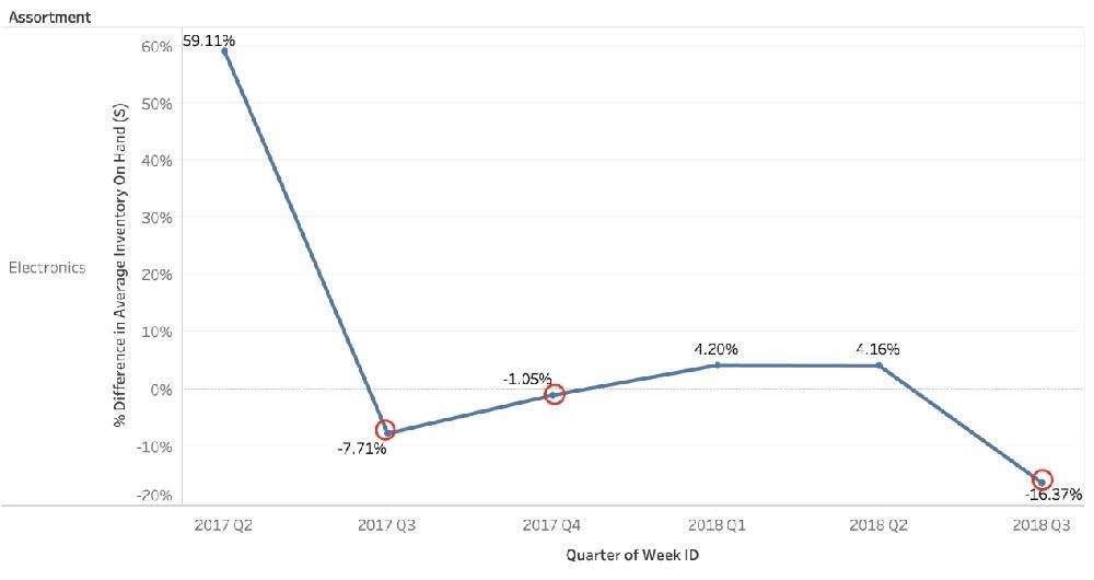
Using the Time Series table, create a chart that shows the percent difference in Average Inventory on Hand for each Assortment by year and quarter. How many quarters did the Electronics Assortment show a negative percent difference in the Average Inventory On Hand?
A. 1
B. 2
C. 3
D. 4
A field that shows average home values for the United States in 2016 is most likely :
A. A discrete date part dimension
B. A continuous date value dimension
C. A geographical dimension
D. An aggregated measure
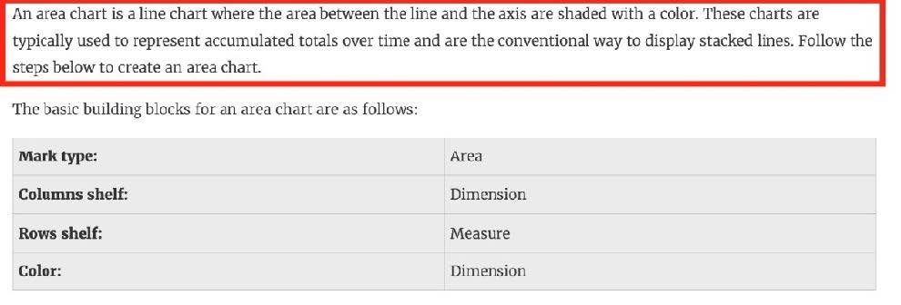
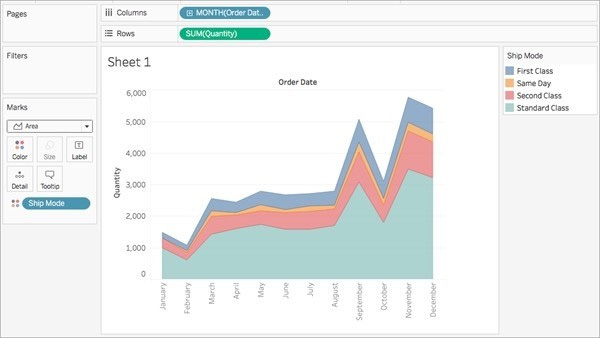
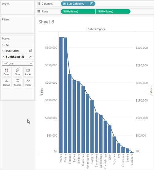
Which of the following charts types always includes bars sorted in descending order?
A. Pareto Chart
B. Pie Chart
C. Gantt Chart
D. Stacked Bar Chart
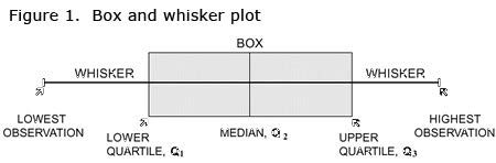
What does the box in a box plot represent?
A. Maximum value of the data
B. Minimum value of the data
C. The interquartile range
D. The median of the middle half of the data points